CMS
Basics
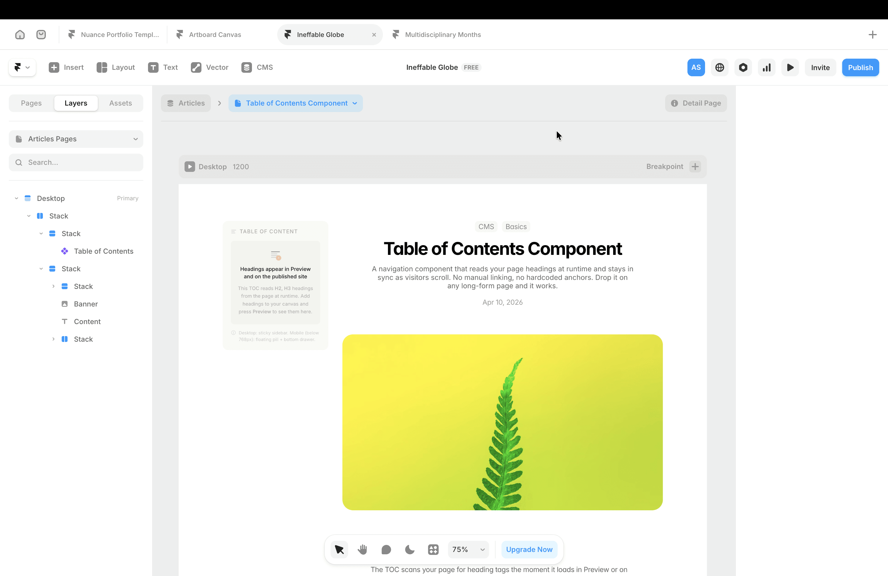
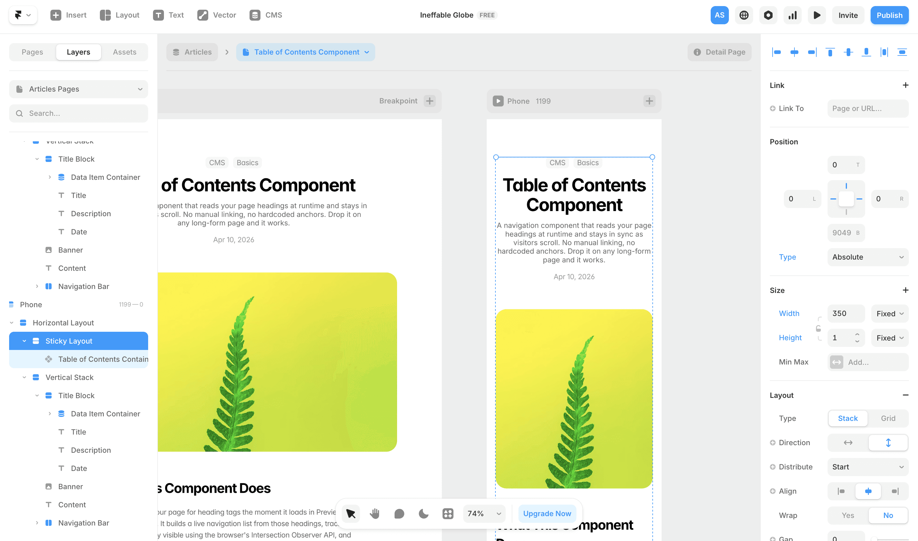
Table of Contents Component
A navigation component that reads your page headings at runtime and stays in sync as visitors scroll. No manual linking, no hardcoded anchors. Drop it on any long-form page and it works.

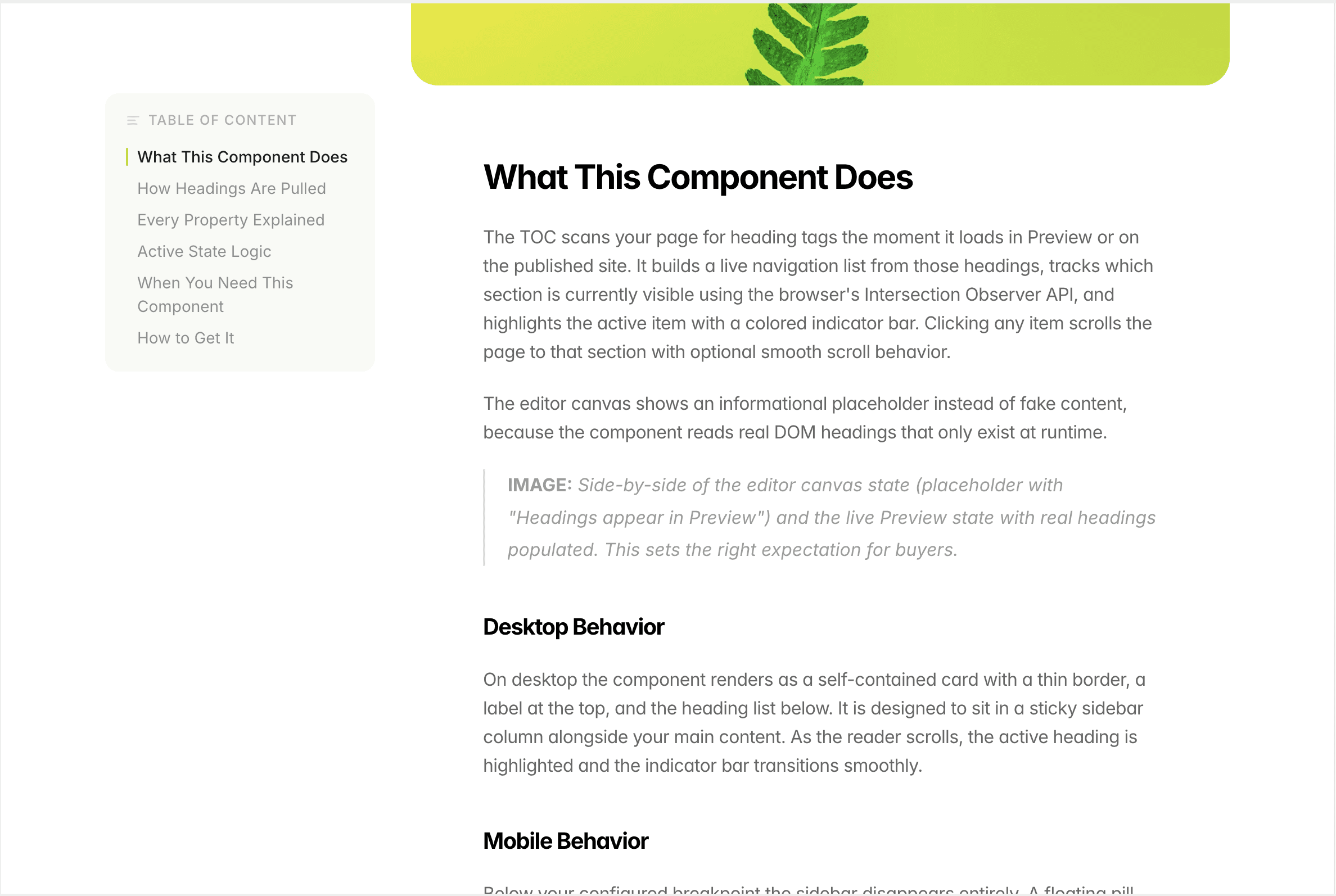
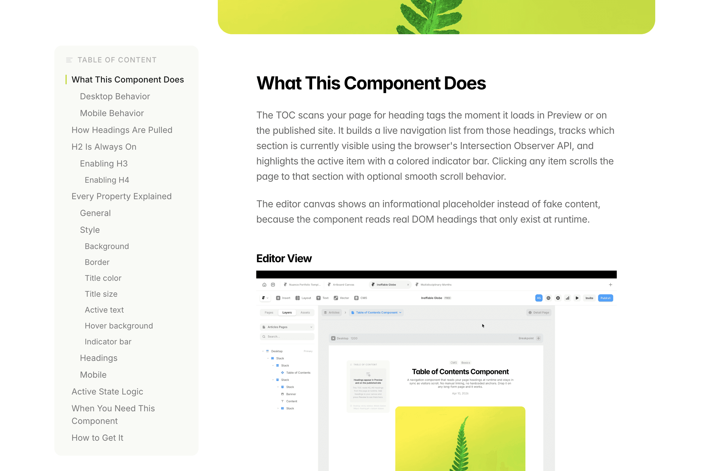
What This Component Does
The TOC scans your page for heading tags the moment it loads in Preview or on the published site. It builds a live navigation list from those headings, tracks which section is currently visible using the browser's Intersection Observer API, and highlights the active item with a colored indicator bar. Clicking any item scrolls the page to that section with optional smooth scroll behavior.
The editor canvas shows an informational placeholder instead of fake content, because the component reads real DOM headings that only exist at runtime.
Editor View
Preview/Published view
Desktop Behavior
On desktop the component renders as a self-contained card with a thin border, a label at the top, and the heading list below. It is designed to sit in a sticky sidebar column alongside your main content. As the reader scrolls, the active heading is highlighted and the indicator bar transitions smoothly.
Mobile Behavior
Below your configured breakpoint the sidebar disappears entirely. A floating pill button appears fixed at the bottom center of the screen. The pill shows the name of the currently active section so the reader always knows where they are. Tapping it opens a bottom drawer with the full heading list, a drag handle at the top, and a close button. Tapping any item scrolls to that section and closes the drawer automatically.
How Headings Are Pulled
The component queries the page DOM using a CSS selector built from whichever heading levels you have enabled. It assigns IDs to any heading that does not already have one, then registers an Intersection Observer on each heading element to track visibility.
H2 Is Always On
H2 is the base level and cannot be disabled. Every H2 on your page becomes a top-level entry in the TOC. H2 items sit flush to the left edge by default, though you can add indent if your layout needs it.
Enabling H3
Toggle H3 on from the Properties panel to reveal sub-entries beneath each H2. H3 items render with a left indent (default 12px) that you can adjust. They also have their own font size, font weight, and inactive color, all set independently from H2.
Enabling H4
H4 becomes available once H3 is on. It adds a third level with a deeper default indent (22px). Use H4 only when a section genuinely needs that depth. Three levels of navigation is the practical ceiling for readability.
Every Property Explained
General
Title sets the label displayed above the heading list. Default is "On this page." Change it to match your language or brand voice.
Font accepts any Google Font name, for example Inter, DM Sans, or Lora. The font loads automatically on the live page. Leave it blank to inherit the font from your Framer page styles.
Scroll offset is the pixel distance the page pulls back from the top when you click a TOC item. Set this to the exact height of your fixed navbar so headings do not snap behind it. Default is 80px.
Smooth scroll toggles between smooth animated scrolling and instant jump navigation when clicking a TOC item. On by default.
Style
Background
sets the card background color. Works for both light and dark themes.
Border
controls the card border color. The border is 0.5px by default for a subtle separation.
Title color
sets the color of the "On this page" label and the list icon beside it.
Title size
sets the font size of that label in pixels. Default is 11px, uppercase with letter-spacing applied.
Active text
is the color of the currently visible heading in the list. Should be your highest contrast text color.
Hover background
is the background color that appears behind a heading row when you hover over it on desktop.
Indicator bar
is the color of the thin vertical bar that appears to the left of the active heading. This is the most visible active state signal so make it match your accent color.
Headings
Each heading level has four independent controls.
Size sets the font size for that level's items in the TOC list.
Inactive color is the text color for items at that level that are not currently active.
Indent is the left padding in pixels that pushes items of that level inward, creating visual hierarchy. H2 defaults to 0px, H3 to 12px, H4 to 22px.
Weight lets you choose Light, Regular, Medium, or Semibold for inactive items at that level. Active items always render at Medium (500) regardless of this setting.
H3 and H4 controls are hidden until you enable the respective toggle. This keeps the panel clean when you only need H2.
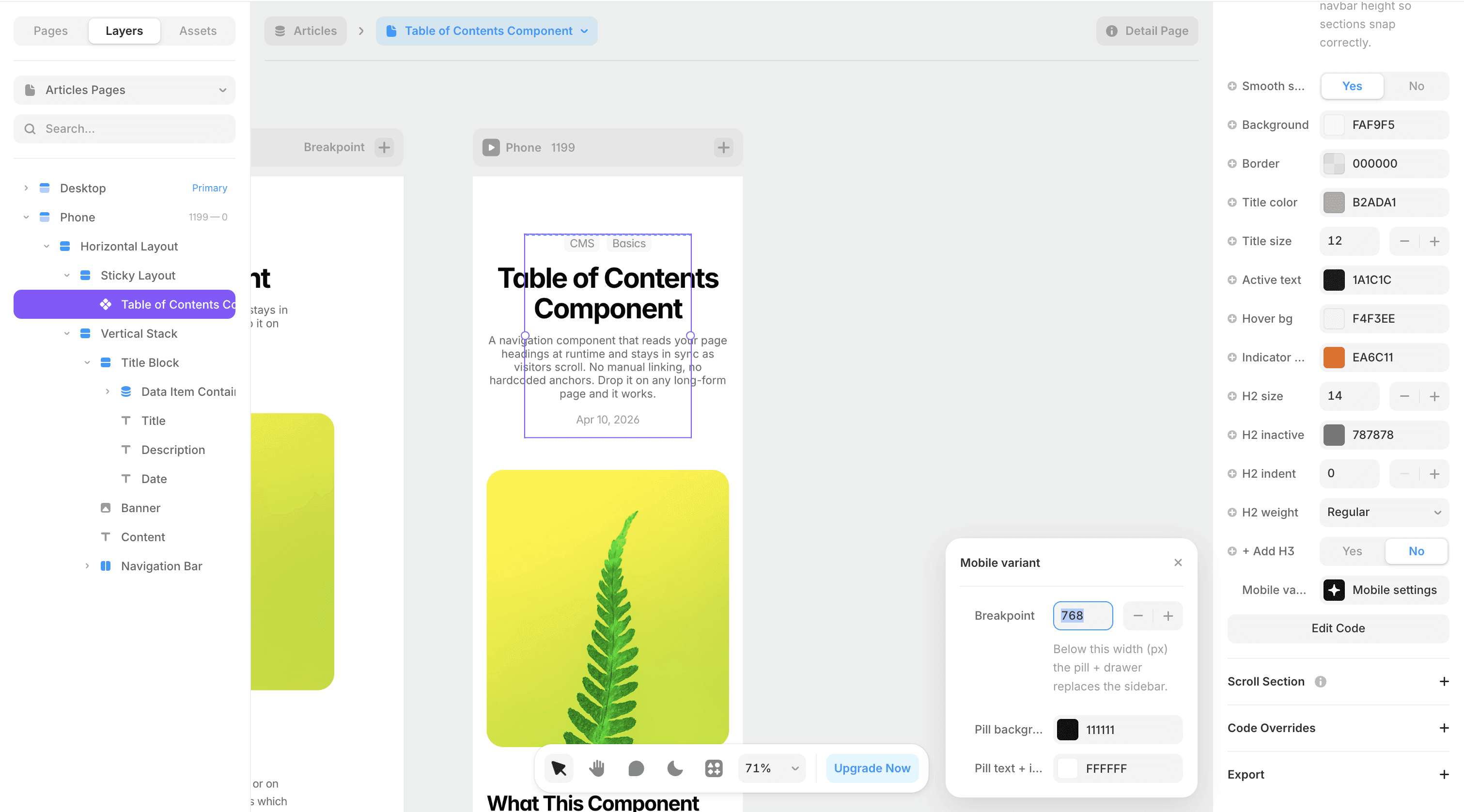
Mobile
Breakpoint is the screen width in pixels below which the sidebar switches to the pill and drawer. Default is 768px. Adjust this if your layout breaks at a different point.
Pill background is the background color of the floating pill button. This is independent from the desktop card background so you can use a dark pill on a light page if that suits your design.
Pill text and icon sets the color of the text and the list icon inside the pill.
The drawer that opens from the pill inherits the desktop Background, Title color, Active text, and Indicator bar colors automatically. You do not set those twice.
Setting Up Mobile in Framer
The mobile pill and drawer are position: fixed in the browser, meaning they anchor to the viewport regardless of where the TOC component sits in your Framer canvas. This is intentional. However, Framer's sticky frame behavior can interfere if the parent layer is not set up correctly.
Recommended Parent Frame Setup
On mobile, the sidebar column that holds the TOC has no useful role. Rather than hiding it with visibility toggles, set the parent sticky frame to the following:
Position: Absolute
Pin: Top, Left, Right
Height: 1px
Overflow: Clip
This collapses the parent frame to a 1px sliver that takes no visual space and does not push your content layout. The TOC component inside it can remain at its normal size. Because the pill and drawer are fixed to the viewport, they render correctly regardless of what the parent frame is doing.
Active State Logic
The component uses Intersection Observer with a root margin of negative offsetTop pixels from the top and negative 55% from the bottom. This means a heading is considered active when it sits in the upper portion of the visible viewport, which matches how readers actually perceive their position on a page.
When you click a TOC item the component records which heading you targeted, scrolls to it, and waits for the Intersection Observer to confirm that heading has entered view before updating the active state. A 600ms fallback timer catches cases where the scroll lands on a heading that is already in view and would not otherwise trigger the observer.
When You Need This Component
This component earns its place on pages where the reader needs orientation across a long scroll. Good fits include Blogs, UX case studies, documentation pages, help articles and changelogs
If your page has fewer than three headings or the content is short enough to read in one sitting, skip the TOC. Navigation that is not needed becomes visual clutter.